Yet another map that may help with understanding the service changes (cuts) proposed by SacRT.
I attended the SacRT board meeting last evening, where there was a presentation by staff on the service changes (agenda item 13), some public comment, and some questions from the board. The gist of the comments and questions seems to be “don’t cut my route,” which is understandable, but doesn’t really advance the discussion much. Mike Barnbaum had the most interesting comments, as he had some innovative ideas for redesigning routes. I briefly presented my design ideas explicated in a previous post (SacRT service changes), and commented that, for the public, the selection of service changes is too much of a black box, input necessary savings, turn the crank, and get out service changes. General Manager Mike Wiley suggested a lot of complex analysis goes into the proposals, addressing in particular questions that were asked by the board about destinations and attractors, however, it isn’t apparent to the public what the criteria are and how they are weighted. Anyway, on with the map.
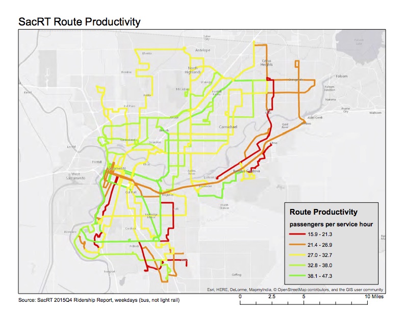
The map (pdf SacRT_productivity-R2)shows all bus routes for which ridership data is available from the SacRT Monthly Performance Reports page. I selected the last available report, fourth quarter 2015, for weekdays. The variable mapped is “passengers per service hour” which is one of the metrics used to measure productivity, and therefore make decisions about routes, but it is certainly not the only metric. The SacRT minimum goal is 27 passengers, so that is one of the break points, with red and orange routes below that level. Only bus routes are mapped, not light rail, because I am not sure if light rail numbers are directly comparable to bus routes. They are certainly much higher, at least for Blue and Gold, as the trains have a much higher capacity than buses.
I realize that all these maps I’m creating would be more useful if presented all together, in an interface that allows the user to turn them on and off, looking at different combinations. That is a part of ArcGIS that I don’t know yet, so there is perhaps my next learning opportunity.
