a graphic for transportation mode share

As I am working on ideas about the City of Sacramento update of Street Design Standards, I am realizing that though details are important, the most important of all, and what should be completed before getting back down to the details, is a statement of values about our transportation system, which we do not have. And there should be a clear, concise graphic that the public can easily grasp, to go with that. So, some ideas.

I’ll start with my favorite of all time, from Complete Streets Chicago. Finding this graphic a number of years ago gave me a framing for what I want to see in our transportation system, and really changed how I think about and communicate about transportation.

Chicago Complete Streets mode share graphic

I just modified this for Sacramento. Why the switch between transit and bicycling? Until the county and region fund transit at a level that allows it to be effective, it is not going to be number 2. I wish it were, but meanwhile, I think bicycling takes number 2.

Chicago Complete Streets mode share graphic modified for Sacramento
Read More »

Parkway trail low points

There are two low spots on the American River Parkway trail (officially called the Jedediah Smith Memorial Trail) that flood even under moderate rainfall or flood conditions. It may seem strange to bring these low spots up when just last week perhaps 90% of the trail was underwater. The trail is in a riparian area, and so will and should flood during major flood events. But the trail is also a major commuter route for hundreds people who work downtown and live to the east, as well as a few reverse commuters like myself. After the jump, details and solutions for these two problem spots.

Read More »

Central city commute times

Here is the second map generated from American Community Survey data, this one showing average commute times by zip code. Nothing surprising here, the central city still compares well with other areas of the county, but there are some interesting patterns in the Sacramento County map (commute time), such as the northeast county in which I’m guessing people are commuting to Roseville rather than downtown, and therefore have reasonable commute times.

Sacramento-central-commute-time

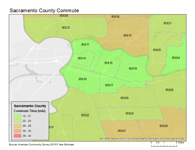
If I were looking at commute times for surrounding counties, I suspect the average commute times would be significantly longer, since many people are commuting into employment centers such as downtown, Roseville, and Folsom. I have to admit that my own commute is long, 30 minutes to 90 minutes depending on where I’m working in the eastern suburbs. But I’d much rather be on a bike for 90 minutes than in a car for 20 minutes. I use transit at times, but for most trips it is either the same or longer to my work destination, so I use it mostly on horrible weather days and when I need to get work done on the way there or the way home.

Since this map doesn’t require much explanation, I’ll say more about census data. The American Community Survey has some very complex questions, such as whether you departed for work between 6:00AM and 6:30AM, but it can’t seem to find the bandwidth for some simple but very useful questions such as “Is your commute multi-modal? What percentage?” A person can only answer in one category: car/truck/van, bicycling, walking, transit, or other. If a trip is 51% transit and 49% bicycling, it shows up as an entirely transit trip. If a person drives 15 minutes to a parking garage and then walks 10 minutes to work, it shows up as an entirely driving trip. A number of people have suggested that this single mode constraint over-emphasizes the mode share for driving and therefore underemphasizes walking, bicycling and transit.

I will be looking at the National Household Travel Survey, last completed in 2009, to see how it compares to the American Community Survey. There is also a California Household Travel Survey, which looked at things is a much more detailed manner, but did not provide anywhere near the coverage of a census, sampling only typical parts of the state in detail.

How do central city people get to work?

Many central city residents have claimed recently that they can’t get to work if there isn’t parking both at their residence and at their work. I was curious just how central city folks do get to work, so I delved into census data (more about that below the graphic).

Turns out a lot of central city residents don’t drive to work. In 95814 (where I live) and 95811, about 56% use privately owned vehicles (POV = car/truck/van), but the other 44% walk, bicycle, use transit, or work from home. That is remarkable! When you think about how much attention and money we devote to those who drive, it eye-opening. Other areas near the central city have high active and transit use, but it falls off rapidly in most of the suburbs (but not all). The map below zeroes in on the central city. The Sacramento County Privately Owned Vehicles (POV) Commute is also available.

Sacramento-central-commute


So, where does this information come from? The American Community Survey, 2014 version, which has estimated data covering a five year period. The report from which I extracted the data is S0801, Commuting Characteristics by Sex. The field mapped above is HC01_EST_VC03, which is “Total; Estimate; MEANS OF TRANSPORTATION TO WORK – Car, truck, or van.” I think the symbology (colors) I used represent what I’m trying communicate – green is good, red is bad.

It took quite some time to find the fields I was looking for, and the search tool does not make it easy (http://factfinder.census.gov/). Then it took some time to figure out how to extract the data fields I wanted and dispose of those I did not. And then it took a LOT of time to figure out how to get ArcGIS ArcMap to match the zip coded commuting data with the county’s zip code map. Turns out that Excel does not properly label the data type of a field, so either the zip code was a number, which didn’t match the text in the zip code layer, or the rest of the data was text, which could not be symbolized properly. I had to use Apple Numbers to create an export format that retained the correct field type. But now that I know how to do this, I’ll have some more maps to share soon.


less commuting, more livability

Q-St-10th-St_SaratogaTownhomesIn my previous post, I suggested two major changes to the street grid in downtown/midtown Sacramento, one to eliminate one-way streets, and the second to convert all three-lane streets to two-lane streets. Of course there is an overlap between these changes, as all of the three-lane streets are also one-way streets.

The goal of these changes is to make it harder to commute to and from downtown Sacramento by car. Yes, that is my intention.

By way of explanation, I go back to Williams Burg’s documentation of the intentional de-population of downtown, and to a smaller degree, of midtown. There is an insufficient housing stock of all types in the downtown area, and in the midtown area there is a lack of some kinds of housing, primarily single family housing. I’m not talking here about separate housing, the suburban model of isolated houses on isolated lots in isolated communities, but of housing designed for families to live in that are not like apartments with shared facilities. Tapestri Square on 20th St is one example of this kind of single family housing, but there are many more both new and older. And of course there are Victorians still available which have not been subdivided into spaces too small for a family.  Housing is gradually being added back into midtown. Where I live at 16th & O, there are two new mixed-use buildings going up, retail below and apartments above. There are others in midtown, and even a few in downtown.

Read More »