As I am working on ideas about the City of Sacramento update of Street Design Standards, I am realizing that though details are important, the most important of all, and what should be completed before getting back down to the details, is a statement of values about our transportation system, which we do not have. And there should be a clear, concise graphic that the public can easily grasp, to go with that. So, some ideas.
I’ll start with my favorite of all time, from Complete Streets Chicago. Finding this graphic a number of years ago gave me a framing for what I want to see in our transportation system, and really changed how I think about and communicate about transportation.
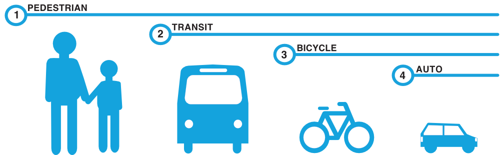
I just modified this for Sacramento. Why the switch between transit and bicycling? Until the county and region fund transit at a level that allows it to be effective, it is not going to be number 2. I wish it were, but meanwhile, I think bicycling takes number 2.

San Francisco considers itself a transit-first city, and in some ways it is. Much of the city has a great system of light rail, subway, and bus routes that run at a reasonable frequency. On the other hand, I experience it more as aspirational than factual. Nevertheless, it is worth keeping in mind that there are such cities, even in the US. New York being the other one.
I have also looked for graphics that make explicit the shift from the mode share we have to the mode share we want. Here is another from Chicago that I find interesting, though not exactly what I’m looking for. I did not find a more recent one, but I’m sure it would look significantly different.

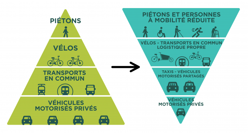
Here is a where-we-are to where-we-want-to-be graphic from Paris. Even though it is in another language, I think it communicates quite clearly. And Paris has made significant progress towards that goal in the last few years!
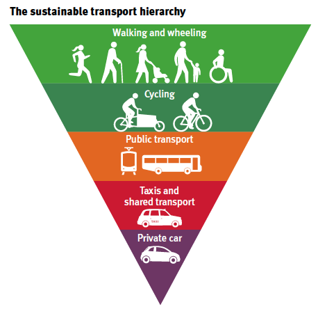
And another one, with different categories but a similar message, from Edinburgh.
The City of Sacramento Technical Background Report, dated 2020, for the General Plan 2040 update, has the following table about commuting mode share. The document uses only commute data in the mobility section. No mention of other trips, nor any indication of an effort to obtain data for other trips. If you look at the work-from-home share, you will see this data is completely out of date and must be updated before use in the plan. But it does provide a data point. Note also that this is data for the entire city. Mode share for the central city and streetcar suburbs is likely to be very different.

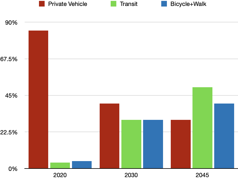
These are not the categories I would use, nor the categories used in the Mayors Climate Change Commission recommendations. The MCCC uses all trips, not just commute trips. As you may know, basing transportation decisions and investments on commute trips is a mistake, because commute trips are only about 15% of total trips, and are declining. Through there isn’t data yet, so far as I know, it is widely acknowledged that traffic in many areas of the city is back up to what it was before the pandemic, but there has been a shift from commute trips to trips for other purposes. Nevertheless, I can make a graph to compare, with of course many assumptions. I have not seen any city or regional estimates of work from home at the moment, so I’ve left that off the chart. You would think that with such ambitious goals for a shift in mode share, only 8 years away, the city would be doing everything it can to reduce motor vehicle VMT and increase walking and bicycling. But the city is not.
Lastly, I will say that I don’t like pie charts. If you search on the Internet for graphics of mode share, you will mostly find pie charts. They don’t communicate much unless you look at them closely, and look at the data, and I don’t think they mean much of anything to the public. The pie charts of GHS emissions are somewhat more useful, and I might use those, but not for mode share.

In redefining Sacramento’s Street Design Standards, prioritizing values for our transportation system is crucial. A concise graphic, akin to Complete Streets Chicago’s impactful model, can effectively communicate these values to the public. Implementing public transportation software can streamline the integration of these standards, ensuring a more efficient and people-centric city transport infrastructure.
LikeLike