Maps have suddenly become the preferred method for presenting information, which is a good thing. But I see so many maps that don’t present what they are claiming to present, or supporting the story being told in the text. Ack!
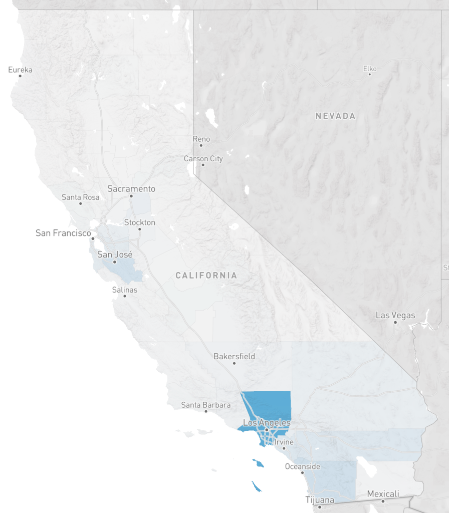
Since coronavirus maps are the rage, I’ve selected two to show. These are from the UCSF Health Atlas, which just added COVID-19 data by county. Take a look for yourself, a fascinating website, that I was not aware of until today. The first map is of COVID-19 cases. It shows Los Angeles county as having the most, followed by San Diego county and then Santa Clara county. The second map is of COVID-19 cases per 100,000 people. It shows Mono county as having the highest rate, followed by San Mateo county.

Remarkably different maps, eh! Why?
Numbers don’t tell a story of any use to responding to the pandemic, or of any other planning effort. The important quantity is rate, and in this case the rate is per 100,000 people. The table below shows a selection of counties and their statistics. If one looked at just the numbers, Los Angeles county would look like a horrible place to be. Yet the rate is below a number of other counties in California. Los Angeles county contains over one-quarter of the people in California. In fact, Mono county is the worst place to be right now, with a rate far above any place else in the state.
| County | CV number | CV rate | density | population |
| Los Angeles | 5955 | 59 | 5076 | 10,098,052 |
| San Diego | 1326 | 40 | 2728 | 3,302,833 |
| Santa Clara | 1207 | 63 | 3186 | 1,922,200 |
| San Francisco | 568 | 66 | 11,413 | 870,044 |
| Mono | 19 | 135 | 17 | 14,174 |
| Inyo | 11 | 60 | 126 | 18,085 |
| San Mateo | 555 | 73 | 3237 | 765,935 |
| Marin | 141 | 54 | 2294 | 260,295 |
The second major issue that number maps lie about is the importance of density. It is currently popular, especially among NIMBYs (not in my backyard), but even some in the medical profession, to claim that density is a problem, that density has fueled spread of the virus. And that once the pandemic is over, the prominence of cities will be over, that everyone will realize that the suburbs were the best and safest place all along, and go back to their long distance commutes. Bullshit! If density were the problem, San Francisco city/county would have the highest rate, but its rate is fairly average for California. And largely rural counties like Mono would have very low rates, but its rate is the highest. Before you ask, no, I don’t have similar data for New York, nor I am sure what it would show.
All of this comes with the standard disclaimer that COVID-19 cases are dependent upon testing, but testing has been widely variable in different counties. I have not seen any statistics on testing at the county level, but that is another data set that could be used to normalize cases in the similar way that population is used to normalize cases. And as the pandemic progresses and the curve declines (someday), the data may look very different. But in the meanwhile, the best we have and the best we can do for planning is to use rates.
So how does this relate to transportation, the topic of this blog? Transportation agencies, both road builders and so-called safety agencies (OTS and NHTSA) almost always report numbers and not rates, and make claims about what is important based on those numbers. They are reluctant to report rates, or anything, though if you read to the end of their reports, or search in their data tables, the rates are usually there, just not obvious. They agencies are also very reluctant to compile pedestrian counts or bicyclist counts, claiming it is too expensive, but really what they are saying is that pedestrians and bicyclists are not important enough to count. They wouldn’t like the statistics that result from data normalized by trips numbers or trip length for pedestrians and bicyclists, because such data would probably force them to select different projects and have different priorities than the ones they have.
The Health Atlas also has data on Street Connectivity, which I hope to explore since it relates so strongly with walkability and bikeability.
