SacCity SB 535 disadvantaged communities and density

The City of Sacramento General Plan 2040 update draft offers a map of the SB 535 disadvantaged communities (DAC), on page 7-6, reproduced below. The areas are census tracts, and their number is labeled. Census tracts do not necessarily follow city boundaries, some overlap with county areas.

The general plan text states “Under SB 535, a DAC is defined as an area scoring in the top 25 percent (75th – 100th percentile) of all California census tracts for pollution burden and socioeconomic factors as measured in CalEnviroScreen.” You can read more detail about how DACs are determined, and the relationship to CalEnviroScreen, on page 7-3.

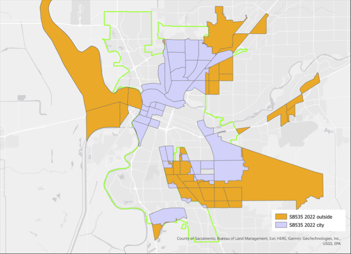
It is good that the area of ‘the finger’ (also known as the Fruitridge/Florin study area), disadvantaged communities in south Sacramento, are included, but it also makes the map hard to read. What areas are actually within the city, where the city might invest to overcome the past disinvestment that created these disadvantaged communities? To look at this question, I created the map below, which distinguishes city from county, blue being city and orange being county. It is clear that ignoring that significant areas of south Sacramento are in the county would be a mistake, but it is important to note where the city disadvantaged areas are, because that is where the city could spend money.

But these type of maps, where an area is mapped without reference to other characteristics, can be misleading. For example, the large area on the southeast side is indeed disadvantaged, but it is also mostly low density and even agricultural. The Census Bureau indicates that census tracts range between 1200 and 8000 people, with an average of 4000. Sacramento does not have such a wide range, but nevertheless, there are significant differences in the number of people residing in each census tract. The table ‘Table EJ-1: CalEnviroScreen Scores of DACs in the Planning Area’ (pages 7-4 & 7-5) lists the population density of all the tracts in the city, but unfortunately this data is not mapped. Of the disadvantaged census tracts, the population density (residents per acre) in the table range from 3.71 (6067006900, north area) to 20.71 (6067000700, northwest downtown)

So I developed a map that shows the range of densities (this is calculated for my map from area of census tract and population in 2022, not from the city’s table; the city does not indicate the date of the table data). A higher intensity of blue indicates more dense census tracts in the city, and for the county, a higher intensity of orange. As you can see, some of the city census tracts that are indicated as disadvantaged are very low density.

Why is density important? The city will never have enough money, from its own budget or other sources, to overcome past disinvestment. So investments must be prioritized. I believe the most important criteria is population density. A dollar of investment in a higher density area reaches more people. Conversely, investment in a low density area reaches fewer people. This fact is glossed over in the general plan.

There are additional maps of the disadvantaged census tracts in the general plan, focused on particular areas of the city, and addressing such issues as healthy food resources, environmental justice issues, parks, and light rail transit. It should be noted that SB 535 disadvantaged communities are only one criteria for looking at an area. The state offers Low Income High Minority (LIHM), and SACOG uses that criteria among others. All of these criteria are important, but I believe density to be one of the most important.

You may comment on the General Plan under the ‘Self-Guided Workshop‘. For a good explanation of how to use this resource, see my previous post relaying the House Sacramento guide. For my earlier posts on the General Plan, see category: General Plan 2040.

PDF versions of the maps are available: SB 535 census tracts from General Plan; SB 535 city/county; SB 535 weighted for population density.

the problem with maps

Maps have suddenly become the preferred method for presenting information, which is a good thing. But I see so many maps that don’t present what they are claiming to present, or supporting the story being told in the text. Ack!

Since coronavirus maps are the rage, I’ve selected two to show. These are from the UCSF Health Atlas, which just added COVID-19 data by county. Take a look for yourself, a fascinating website, that I was not aware of until today. The first map is of COVID-19 cases. It shows Los Angeles county as having the most, followed by San Diego county and then Santa Clara county. The second map is of COVID-19 cases per 100,000 people. It shows Mono county as having the highest rate, followed by San Mateo county.

COVID-19 cases, source UCSF Health Atlas
COVID-19 map, cases per 100,000 people

Remarkably different maps, eh! Why?

Numbers don’t tell a story of any use to responding to the pandemic, or of any other planning effort. The important quantity is rate, and in this case the rate is per 100,000 people. The table below shows a selection of counties and their statistics. If one looked at just the numbers, Los Angeles county would look like a horrible place to be. Yet the rate is below a number of other counties in California. Los Angeles county contains over one-quarter of the people in California. In fact, Mono county is the worst place to be right now, with a rate far above any place else in the state.

CountyCV numberCV ratedensitypopulation
Los Angeles595559507610,098,052
San Diego13264027283,302,833
Santa Clara12076331861,922,200
San Francisco5686611,413870,044
Mono191351714,174
Inyo116012618,085
San Mateo555733237765,935
Marin141542294260,295
selected county statistics

The second major issue that number maps lie about is the importance of density. It is currently popular, especially among NIMBYs (not in my backyard), but even some in the medical profession, to claim that density is a problem, that density has fueled spread of the virus. And that once the pandemic is over, the prominence of cities will be over, that everyone will realize that the suburbs were the best and safest place all along, and go back to their long distance commutes. Bullshit! If density were the problem, San Francisco city/county would have the highest rate, but its rate is fairly average for California. And largely rural counties like Mono would have very low rates, but its rate is the highest. Before you ask, no, I don’t have similar data for New York, nor I am sure what it would show.

All of this comes with the standard disclaimer that COVID-19 cases are dependent upon testing, but testing has been widely variable in different counties. I have not seen any statistics on testing at the county level, but that is another data set that could be used to normalize cases in the similar way that population is used to normalize cases. And as the pandemic progresses and the curve declines (someday), the data may look very different. But in the meanwhile, the best we have and the best we can do for planning is to use rates.

So how does this relate to transportation, the topic of this blog? Transportation agencies, both road builders and so-called safety agencies (OTS and NHTSA) almost always report numbers and not rates, and make claims about what is important based on those numbers. They are reluctant to report rates, or anything, though if you read to the end of their reports, or search in their data tables, the rates are usually there, just not obvious. They agencies are also very reluctant to compile pedestrian counts or bicyclist counts, claiming it is too expensive, but really what they are saying is that pedestrians and bicyclists are not important enough to count. They wouldn’t like the statistics that result from data normalized by trips numbers or trip length for pedestrians and bicyclists, because such data would probably force them to select different projects and have different priorities than the ones they have.

The Health Atlas also has data on Street Connectivity, which I hope to explore since it relates so strongly with walkability and bikeability.

SacRT routes & population density

SacRT with density and income

Investigating the proposed SacRT service changes (cuts), I identified that routes serving low density areas are a problem. I developed the map below (pdf SacRT_pop-density) showing routes and population density, with low density areas shown in red. Two routes stand out as servicing primarily low density areas, which are unlikely to ever be productive in a ridership sense. In fact, one of the reasons SacRT struggles to provide efficient transit service is the low-density nature of the county. Though of course agricultural areas north and south of the urbanized area will be low density, there are also large areas of low-density suburb and exurb (sprawl) which will never be successful. Every greenfield development allowed by the county and cities just exacerbates this problem

The population data is from the American Community Survey (ACS) 2014 5-year estimate (S1903), selected by census tract and matched to census tract outlines provided by SACOG, showing residents per square mile. The routes are from the Google Transit Feed Specification (GTFS) provided by SacRT. All routes are shown, including commute hours, low frequency, moderate frequency, and high frequency routes, as well as routes operated by SacRT under contract with others. It would be more useful to identify and/or separate out different kinds of routes, but it takes a while to compile that data, and I’m not quite there yet.

Read More »

Sacramento Population Density

I ran across a neat website, Social Explorer, which presents census data over time. I made a quick gallery for census tract data from 1950 through 2010 for the Sacramento region, and it is below. Before 1950, data is available only by county, not by census tract. I’ll be exploring this tool more in the future.

This slideshow requires JavaScript.