Corrections: Crash data is from Sacramento Police Department, not SWTRS, but does use the SWITRS selection categories. Demographic data is from the Transportation Priorities Plan.
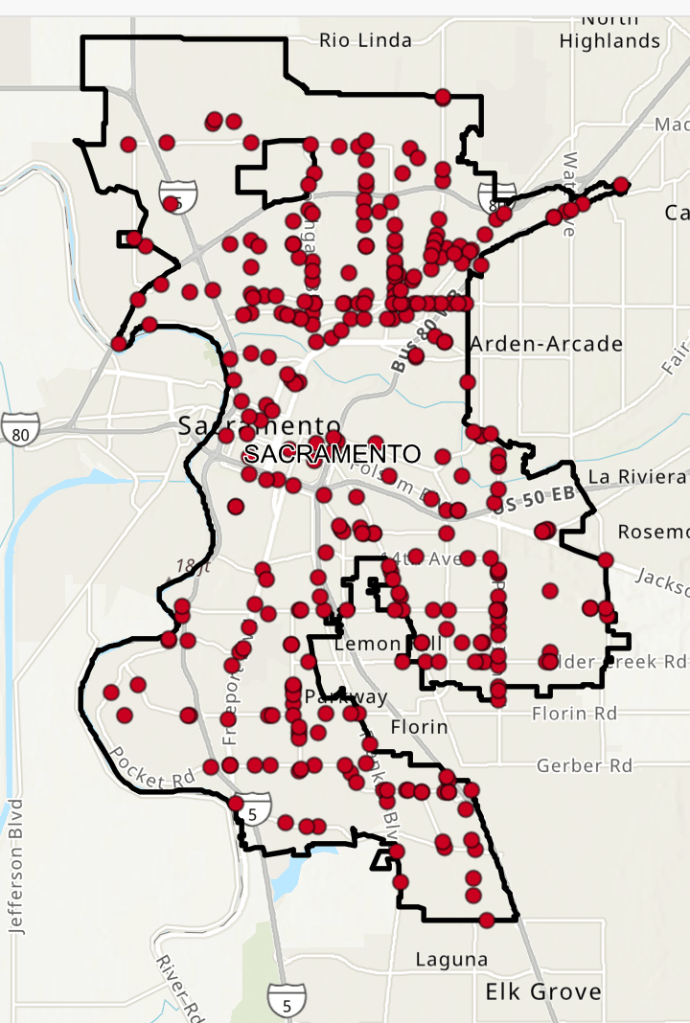
The City of Sacramento has released a VZ Crash Dashboard with an interactive map and charts. The dashboard apparently uses data from SWITRS for crash data (which means that it will never be up-to-date, as SWITRS is never up-to-date, but patterns don’t depend on up-to-date data), but is selected for the City of Sacramento, and also has demographic data layers for ‘SB 535 disadvantaged communities’, ‘neighborhoods that lack transportation infrastructure’, and ‘communities that have been recipients of racism and bias’. You can turn on and off layers, and can select for crashes on a wide variety of criteria, such as ‘severity’ (fatality, severe injury, etc.) and ‘involved with’ (bicycle, pedestrians, etc.), which are criteria from the SWITRS database.
I have only explored the data in a superficial manner, but noticed some interesting geographic patterns. If you look at crash density, the central city looks bad, but for fatalities only, it looks better than many parts of the city. There are several arterial roadways that were identified as high injury network (HIN) corridors but were not in the Vision Zero Action Plan. However, a visual representation does not necessarily reflect the details of data.
What patterns do you see in the crash dashboard?

[…] The City of Sacramento is undertaking an update of the 2018 Vision Zero Action Plan. A recent Sacramento City Express article, Sacramento begins Vision Zero update, launches crash data dashboard, provides a summary. The dashboard has been available since March (SacCity crash dashboard). […]
LikeLike