One of the City of Sacramento Vision Zero Action Plan Update documents, Collision Landscape Summary and Collision Profiles, on page 4, uses a stacked bar chart to graph ‘Driving-only’, ‘Involving People Bicycling’, and ‘Involving People Walking’ data. The chart obscures rather than illuminates the data. The chart from the document is below. It shows the overall trends for KSI (killed or serioiusly injured). Useful, but hides trends for each category. Though dozens of charts follow in the document, not a single one breaks out the basic data by category alone.
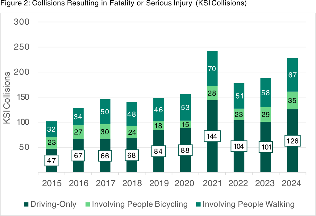
Below is a graphic with the data, and each category separated out. This is what should have been in the report. This is not in particular a criticism of this report or the report authors, but of the use of stacked bar charts in general. See Stacked Bars Are the Worst and many other posts on the weakness of stacked bar charts.
I think the charts below are actually useful to understanding collision trends.

